
The pen. Look at that curvy mofo.
I got this pen for Christmas as part of a kit. It was neat! I got the matte black gold trim version as shown here, but it also was available in a few other colours and trims. Here’s what the Parker webpage has.
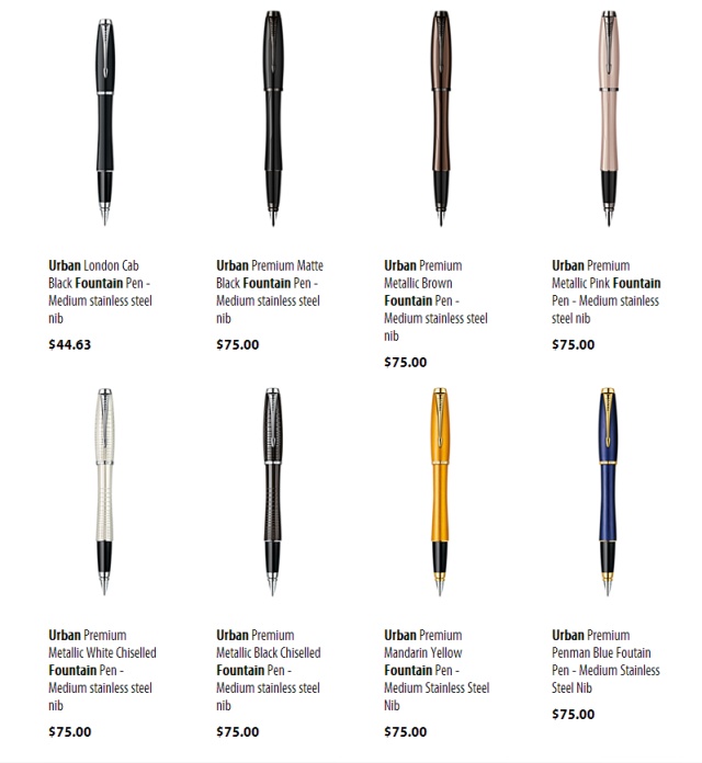
Look at those prices, by the way. HOLY MOLY. Remember, this is a pen whose functional parts are directly from a $10 pen.
I’ll admit, those prices are high, but boy howdy is that a swell looking pen. Once the Chinese companies steal this design, I’m definitely going to buy a few of those. I hope they do, at least. And look at that one on the right, using the blue/gold contrast.

Gold/blue contrast. Google it.
These are some good looking pens, I’ll tell you. Yes, you have eyes. But, my taste is at least twice as good as yours, so you must admit, I am objectively correct in that these are good looking pens. Some of the best looking. Ever. All right, I’ll try to be more objective. Anyway, this is one of Parker’s new pens, slotting in above the IM and below the Sonnet. For more (outdated) information on Parker pens, you should totally hit up Parkerpens.net. It’s a great site. Anyway, onto the quick review.
Performance: 6/10. Yeah, the worst comes first. Those kind of rhyme. That’s neat. Anyway, this pen, you might think, is a Parker. Of COURSE it has some problems performing. To you, I say FEH. I have quite a few Parkers and this is the only one that has issues. What are its issues? It’s a hard starter and it skips. These may seem minor to you, and other reviewers also consider these things minor, but let’s be honest: for $40, you could buy FOUR HUNDRED ballpoints from the dollar store. And you know what? They’re probably not going to be hard starters. Under zero circumstances should we as pen buyers tolerate any skipping of any kind, either. The pen has ONE JOB. TO WRITE. If it skips, then it’s failing at its job. If it skips once, it’s failed.
Of course, this isn’t that unlike real life. If the pen is flaky, but really good when you get it to work, then some things can be looked over. Yeah, the lawn mowing service may have run over your cat, but boy is that lawn looking nice, eh? The HOA best manicured yard awards don’t just get thrown around willy nilly. You can get a new cat, but best yard from 2009 to 2011 is forever. Besides, Fluffy always peed on the carpet anyway, and she chewed up that coaxial cable. She basically had it coming.
In much the same way, even though every five lines you’ll have to rewrite a letter or two with this pen, the interim moments are very nice. The pen is smoother than a sloppy joe, but not quite as smooth as butter yet. In the world of food smoothness, that’s pretty good. A little bit smoother than a hard boiled egg sandwich on wheat, BUT, not quite as smooth as a hard boiled egg sandwich with thinly cut slices on white. I think the analogy is pretty clear. What were we talking about? Oh shit, yeah.
Pens. Anyway, the line this guy writes is ostensibly a medium, but it’s a pretty broad medium. As was seen in the Eight Horses review, this writes a line a little bit wider than a broad Monteverde nib, but definitely not as broad as a Frontier broad. It’s also built well enough that I have written pages and pages of notes at a time and there has been zero cramping or fatigue in my hands. This pen eats up the pages. RIP in peace Clairefontaine notebook.
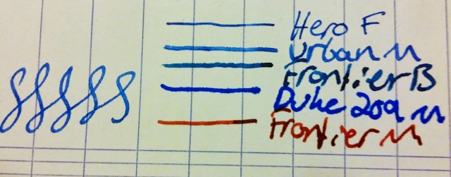
The Urban with a few buddies, as labelled. Those S things that everyone does in these reviews. Is that to show line variation in angle of the writing? I don’t really know. I did ’em anyway.
Appearance: 8/10. Despite me thinking that this is one of the hippest looking pens to come out of Parker, some have called this pen girly. Those people are wrong. This pen looks awesome. However, it doesn’t get a ten for two reasons.
The first is the lack of flighter. THIS IS A PARKER. I REQUIRE A GOLD TRIM STAINLESS STEEL PEN. I have some pretty low end Parkers that are still flighters. I mean, the 45 was, the Latitude was, the Inflection was, the Frontier was. For serial, dude. I love them things. I feel like they might be throwing away a little bit of money not putting that option in for this pen.
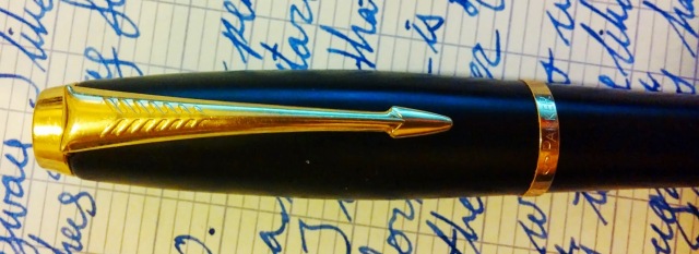
It’s best to look at this through a mirror, lest you be turned to stone.
Okay, it’s not Medusa bad, but it’s definitely 2001 Lexus SC430 bad.
The second is that clip. I hate that clip. I also hate the Latitude and Inflection clips, but less so. What is this crap? That no longer looks like an arrow. The fletching must be farther out than the shaft. Here, it’s a smooth transition: a nice curved line. Don’t give me that crap. The fletching should be easily distinguishable in silhouette. I know these are minor quibbles, but Parker has screwed itself by being so fabulously well designed in the past that such a major departure from that is annoying to me. I don’t know. I might be crazy.
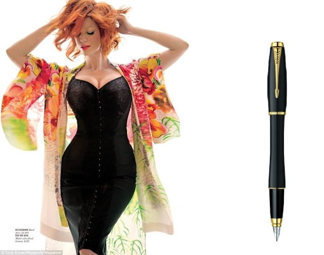
But those lines make up for these problems I have and keep the score high. You know what this pen reminds me of? Christina Hendricks.
You may notice that most of the pictures have the top off if you google it. The pen, I mean. You sicko. The pen’s press pictures have the top off and posted on the back. It does look better that way, I’ll admit. But, I don’t think it works well posted: too top heavy. That is another reason the appearance is only an eight and not a ten.
Build Quality: 8/10. The pen’s solid. Rock solid. A good rock, like granite, or basalt. Not slate or shale. That stuff breaks like it’s going out of style. You drop shale onto your floor, you’re going to be sweeping up Devonian age dust off your linoleum for the next five weeks. I actually have dropped this pen from my pen cupboard, about six feet up, and guess what? It’s still fine.
It’s also in that sweet spot for weight, at about 30 grams. Probably ten of that is in the cap, but still. When not posted, the pen is perfectly balanced, which is nice. The converter (a slide converter) sits in there snugly, and so do the cartridges, which I often refill for their extremely generous size. The problems arise in the grip section, which feels like cheap plastic, and the threads on the body, which also appear to be plastic. At this price point, especially when skimping on the nib, we should expect some more metal in the important parts of the pen, or at least a nice rubberized grip section, like a Parker Reflex, which is half the price. Come on, Parker.
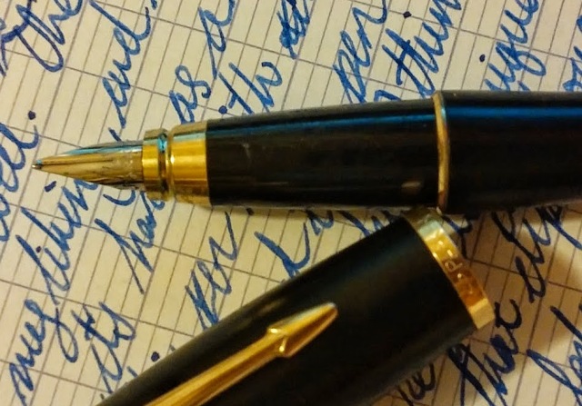
The section in question. Surprisingly comfortable, but only in the way that occasionally you get a good folding chair at an outdoor social gathering.
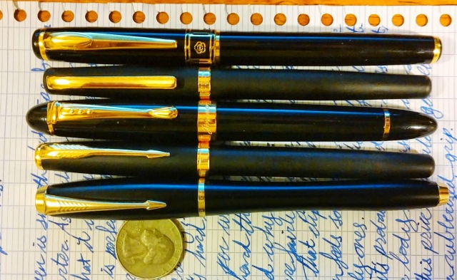
My tastes are varied and colourful.
From top to bottom we have these: a Hero 68, a Duke 209, a Jinhao X450, some Chinese pen I bought cause it looks like a Sonnet for $1 (It’s an unwieldy name, to be sure. They should rebrand that), the Urban about which this review was written, and a quarter from the nineteen seventies.
Refilling and Maintenance: 6/10. Parker supplies a converter with the pen, and one can buy Parker cartridges and bottled Quink at virtually any office supply store around. It’s not hard at all to find them. Because of this, I’ll say that refilling is pretty good. The cartridges are huge, too, so that’s nice. You can go a long time without putting in a new one, even using this pen exclusively. However, due to the small nib, it’s very difficult to take the feed out, and you can’t replace it or the nib but with other Parker nib sections. Since most people don’t bother doing this, I’m going to say that this is still on the good side of middle of the road. No concern here at all, but it’s nothing to write home about.
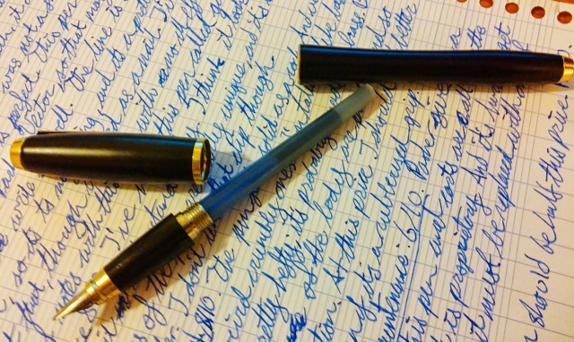
Look at the size of the Parker cartridges! This isn’t Parker ink, either. I filled it up with Hero ink with a blunt syringe. Not bad. Works well. Don’t need to change ink for weeks. Ask me about my vacation clothes washing strategy later.
Value: 4/10. You know how I said worst was first before? I totally lied. This is the worst. The pen costs $40, but it’s only about at the level of a Sheaffer VFM, which is $18. Or, in fact, the Parker IM, which hangs around a more reasonable $20 in stores. These are basically the same pen, but where the IM is more…straight. I guess.

Same pen inside, but the carpet matches the drapes outside. And it’s half the price.
Conclusion: 6.1/10. Great pen, but twice the price it should be. Other pens at the same level but cheaper: Nemosine Fission. Sheaffer VFM. Pilot Metropolitan. Or, if you want a Parker, get the IM. I would recommend that every time over the Urban.
So is there a situation I would recommend the Urban?
Yes. If you really like Christina Hendricks.
Pingback: Parker IM Review | Funkmon on pens.
Christina Hendricks is modestly talented and only marginally literate–and NOT a natural redhead to boot. But . . . I might buy a Parker Urban.